Harmony Vineyard
Company logo design and production for a South-East England vineyard of sparkling wine
The Brief
This South-east England based sparkling wine vineyard required a new logo, with a view to using it on business stationary, signage and bottling labels in the future. The client was keen on playing with the themes of music, grapes, bubbles and wanted a modern but sophisticated look in keeping with the target market for their British sparkling wine product. They wanted a maximum of 2 colours in their primary logo for savings in print runs.
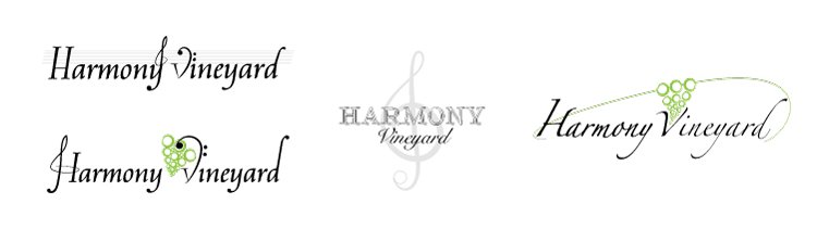
The Process
In the designs I trialled different ways of incorporating treble and bass clef signatures, staves and notes, bubbles styled as grapes and a range of different fonts. The development process was undertaken in 2 distinct phases, both followed by a round of feedback culminating in the final design. Below are a selection of designs from the 2 phases.

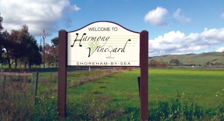
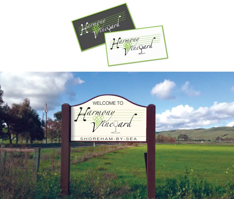
The Product
The finished logo has since been used to produce stationary as well as an onsite signage for the vineyard.
We are delighted with the logo which Beth designed for our new vineyard. We were very impressed how she took on board our ideas and created a polished, professional result. Well worth the money. Cheers!
Bernard West
Harmony Vineyard